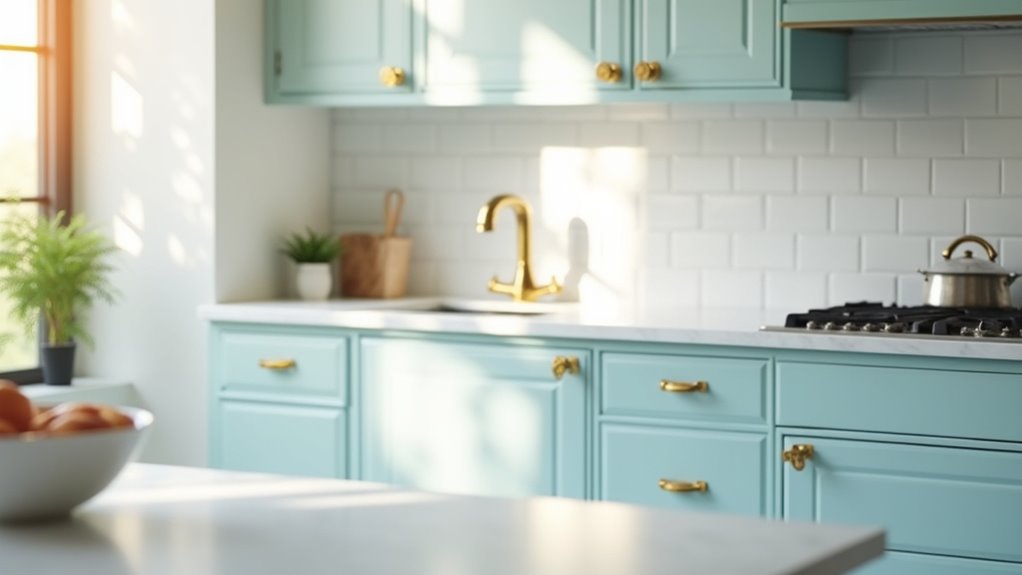

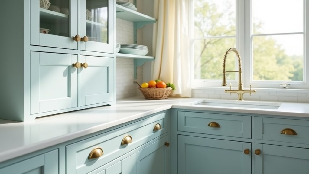
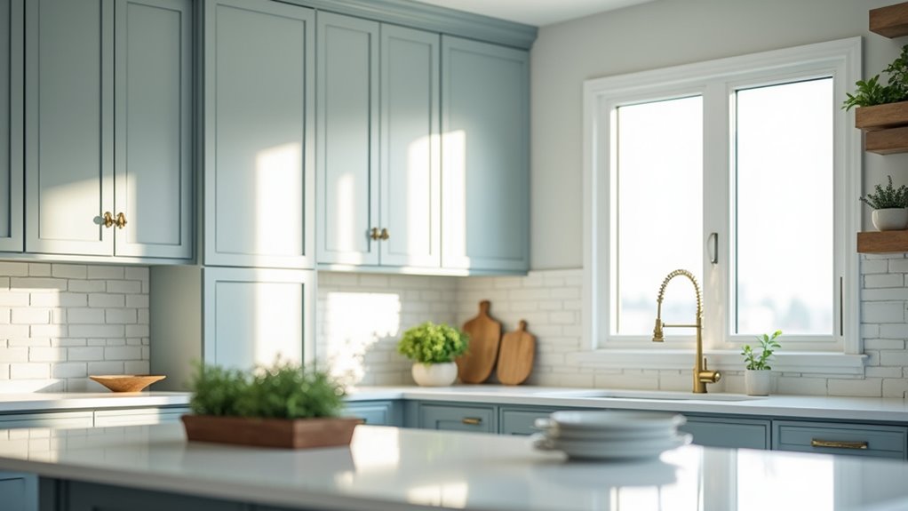
Light blue kitchen cupboard paints offer an inviting blend of tranquility and style. Popular choices include Farrow & Ball’s Borrowed Light for its soft summery feel and Sherwin-Williams Rain, which creates a calming ambiance. Blustery Sky adds a sophisticated blue-gray touch, while Sea Salt infuses spaces with coastal charm. Benjamin Moore’s Palladian Blue balances depth and airiness, making it a favorite for kitchens. Explore these options to discover the unique ambiance each can bring to your space.
Key Takeaways
- Farrow & Ball Borrowed Light: A pale blue that evokes calmness, perfect for family kitchens and durable cupboard finishes.
- Sherwin-Williams Rain: Soft blue with subtle green and gray; versatile for various kitchen styles and creates a relaxing atmosphere.
- Sherwin-Williams Blustery Sky: A blue-gray hue that pairs well with whites and wood, ideal for maintaining airy ambiance in larger spaces.
- Benjamin Moore Palladian Blue: An airy blue-green perfect for kitchen cupboards; balances lightness and tranquility in various decor settings.
- Sherwin-Williams Sea Salt: Muted green-blue that harmonizes beautifully with both warm and cool tones, enhancing kitchen elegance.
Farrow & Ball Borrowed Light (235)
Farrow & Ball’s Borrowed Light (235) captures the essence of a serene summer sky, offering a delicate and pale blue hue that transforms any kitchen space into a calming retreat.
This versatile shade complements various interior styles, promoting exceptional color harmony, particularly when paired with the deep Stiffkey Blue for striking contrast. In addition, its suitable residential spaces make it ideal for creating a soothing atmosphere in bustling family kitchens.
Available in multiple finish options, including matte and high-gloss, Borrowed Light enhances both walls and kitchen cupboards, ensuring durability and a chic aesthetic. Expert assistance is also available to help you choose the perfect finish for your project.
Available in a variety of finishes, Borrowed Light elevates walls and cabinets with durability and stylish elegance.
Its eco-friendly, water-based formula makes it a practical choice for children’s spaces and high-traffic areas alike.
With the right sheen, this soft blue not only brightens poorly lit rooms but also ensures maintenance ease, adding an elegant touch to any home.
Sherwin-Williams Rain (SW 6219)
Sherwin-Williams’ Rain (SW 6219) invites a tranquil atmosphere into any kitchen, blending soft blue with subtle green and gray undertones.
This cool neutral tone exudes a sense of calm and peacefulness, aligning perfectly with color psychology principles that suggest blues promote relaxation.
With an LRV of 49, Rain is a versatile choice, neither too light nor too dark, providing a soothing backdrop for various decor styles—from modern minimalism to traditional charm.
For an inspiring design, it pairs beautifully with soft furnishings and natural materials.
Homeowners are encouraged to test the color with peel-and-stick samples to ensure compatibility with existing decor.
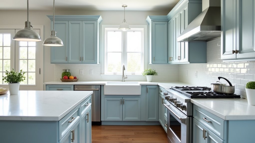
Sherwin-Williams Blustery Sky (9140)
Blustery Sky (SW 9140) casts a serene, blue-gray hue that transforms kitchen spaces into calm retreats.
With subtle gray undertones, this color evokes sophistication and blends effortlessly in modern or traditional designs. Its versatility shines through in various color applications, as it adapts dynamically under different lighting effects.
During daylight, it leans toward a soft blue-gray, while artificial light emphasizes its richer gray tones. Ideal for cupboards and decor elements, Blustery Sky creates an airy ambiance, making larger rooms feel more open.
Perfectly pairing with crisp whites and soft grays, it invites accents of muted greens or warm woods for added depth. This timeless shade offers understated beauty, turning any kitchen into a tranquil haven.
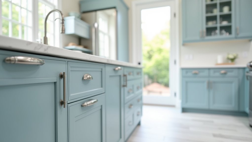
Sherwin-Williams Sea Salt (SW 6204)
Sea Salt (SW 6204) brings a serene touch to kitchen spaces, capturing a delicate balance of muted green with hints of blue and gray undertones.
This versatile color creates a calming ambiance, invoking a fresh, coastal feel that is both inviting and restful.
- Appears more blue in bright, north-facing rooms, while leaning green in warm, south-facing light.
- Perfectly pairs with white trim to enhance its soft elegance.
- Suitable for various room applications, including kitchens, bathrooms, and bedrooms.
With its unique color undertones, Sea Salt harmonizes beautifully with both warm and cool tones, making it an ideal choice for creating a cohesive, tranquil design aesthetic.
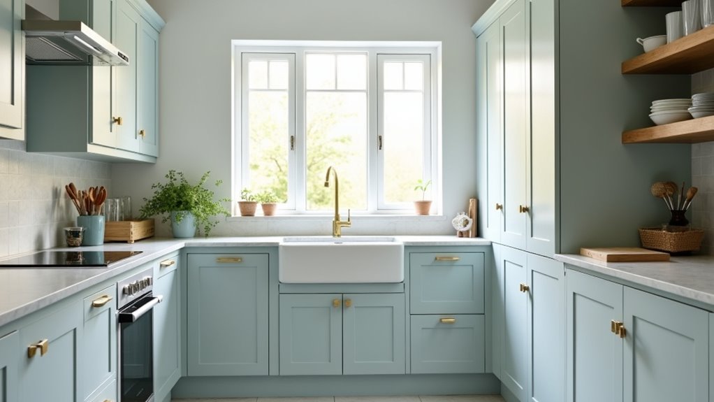
Benjamin Moore Palladian Blue (2062-60)
Benjamin Moore Palladian Blue (HC-144) stands out as a beloved choice for kitchen cupboard paint, embodying a soft, airy blue-green that evokes the tranquility of clear, sunny skies.
With a light reflectance value (LRV) of 60.4, Palladian Blue perfectly balances lightness and depth, creating a calming atmosphere that enhances any kitchen.
Unlike the more vibrant Blue Hydrangea (2062-60), which offers a powdery, uplifting hue reminiscent of spring blooms, Palladian Blue leans towards serene elegance.
This color not only harmonizes beautifully with various décor styles but also complements other shades like Mountain Peak White (OC-121), making it an ideal choice for a fresh new look.
Palladian Blue truly encapsulates a peaceful retreat in a busy home.
Light Blue Paints for Farmhouse Kitchens
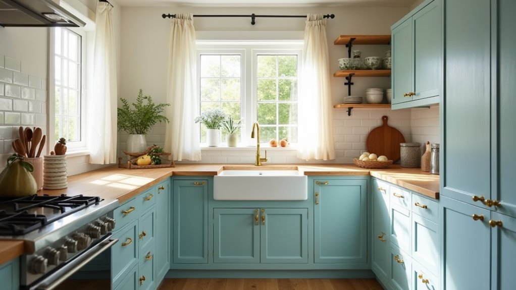
Light blue paints offer an inviting charm that perfectly complements the aesthetics of farmhouse kitchens. These soothing hues bring an air of freshness, enhancing various cabinet styles and inviting warmth into the space.
Popular choices include:
- Robin’s egg blue, which pairs beautifully with whites and beiges for a welcoming feel.
- Light blue gray tones, which blend tranquility with rustic charm, ideal for achieving a cozy atmosphere.
- Soft pastel blues, adding a traditional vibe that harmonizes with natural wood elements.
These light blue shades work well with popular paint combinations, balancing darker neutrals and adding vibrancy.
With their timeless appeal, light blue paints can transform any farmhouse kitchen into a fresh, cohesive sanctuary. Light blue cabinets complement creamy walls for a cozy farmhouse vibe that enhances the overall warmth and timeless appeal of the kitchen.
Light Blue Paints for Coastal Kitchens
What makes light blue such a perfect choice for coastal kitchens? These soft, airy hues evoke the serene skyline and tranquil seas, creating an inviting ambiance.
Colors like powder blue, turquoise, and light blue-grey encapsulate the essence of coastal living, enhancing natural light and promoting a breezy atmosphere.
Popular options, such as Farrow & Ball’s Borrowed Light and Behr’s Watery, skillfully incorporate subtle paint undertones that prevent overpowering the space.
Light blue cabinetry pairs beautifully with natural wood finishes, white countertops, and brass hardware, adding sophistication while preserving a fresh look.
This versatile palette ensures a timeless design, making kitchens feel larger and more connected to coastal accents, ultimately fostering a relaxed and rejuvenating environment.