
Light dining room paint colors optimize spatial perception through strategic Light Reflectance Values (LRV) ranging from 63-88%. Pure White (OC-64) delivers exceptional brightness with an LRV of 79.81, while Ice Mist (OC-67) surpasses this at 88.84 with sophisticated blue undertones. Aleutian (SW 6241) provides calming blue-green complexity, while Sage Green offers muted warmth with natural light reflection. Dusty Rose, Lavender Mist, Buttercream, Chalk White, and Aquamarine complete this curated selection of luminosity-enhancing options that transform confined spaces into expansive dining environments through advanced color theory principles.
Key Takeaways
- Pure White (OC-64) offers exceptional light reflectance with an LRV of 79.81 while preventing stark appearances through subtle grayish undertones.
- Ice Mist (OC-67) delivers superior luminosity with an LRV of 88.84 and sophisticated blue undertones for serene dining atmospheres.
- Chalk White achieves maximum brightness with 83-84% LRV, visually enlarging confined spaces while reducing reliance on artificial lighting.
- Sage Green provides warm, muted tones that reflect natural light softly while coordinating versatilely with neutral and pastel palettes.
- Aleutian (SW 6241) combines calming blue-green hues with optimal light reflection properties and dynamic color-shifting in different lighting conditions.
Pure White: The Classic Choice for Maximum Brightness

Pure White OC-64 represents the quintessential approach to maximizing luminosity in dining spaces through its exceptional Light Reflectance Value of 79.81, which enables substantial light amplification without reaching the harshness of ultra-whites approaching 100 LRV.
The paint’s RGB composition of 230, 232, 226 creates subtle grayish color undertones that temper the coolness while maintaining optimal light reflection properties.
This blue-white formulation prevents stark clinical appearances common with pure optical whites, delivering clean brightness suitable for dining environments.
The controlled cool undertones enhance both natural and artificial illumination, creating spacious visual perception essential for intimate dining experiences. This versatile choice works seamlessly across both modern and traditional dining room settings.
Benjamin Moore’s Regal® Select formula provides superior coverage with flat finish characteristics that minimize surface imperfections while maximizing the color’s light-enhancing capabilities. When selecting dining room fixtures, consider options that complement the paint’s light-reflecting properties to create optimal illumination throughout the space. The tinted product cannot be returned once mixed, so careful consideration of your dining room’s lighting conditions is essential.
Ice Mist OC-67: Cool Contemporary Elegance

Ice Mist OC-67 delivers sophisticated cooling properties through its distinctive blue undertones while maintaining exceptional light reflectance capabilities with an impressive LRV of 88.84, surpassing Pure White’s luminosity by nearly nine points.
This clean white shade creates optimal color applications for contemporary dining spaces requiring enhanced brightness without stark intensity. The advanced Gennex colorant technology ensures consistent color payout across varying lighting conditions, while high-performance resin delivers superior durability and smooth application characteristics.
The psychological impact generates a serene atmosphere conducive to extended dining experiences, with cool undertones promoting relaxation and clarity.
Design versatility allows seamless integration with minimalist furniture and Scandinavian aesthetics. Neutral color pairings amplify the brightening effect, while textured elements introduce visual depth without compromising the sophisticated ambiance essential for modern dining environments. Black dining fixtures with geometric designs complement this cool white backdrop by providing striking contrast while maintaining the contemporary aesthetic through their midnight black finishes.
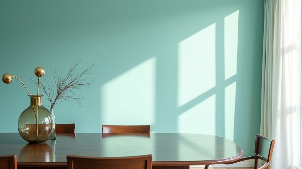
Aleutian SW 6241: Tranquil Blue-Green Sophistication
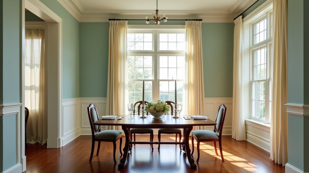
Aleutian SW 6241 establishes sophisticated color depth through its complex blue-green foundation enhanced by subtle gray and lavender undertones that respond dynamically to varying lighting conditions.
This periwinkle-influenced hue leverages color psychology principles to create tranquil dining environments while maintaining visual interest through its moderate saturation levels.
The paint’s LRV of 38.67 provides optimal light reflection for brightening spaces without overwhelming intensity.
In interior design applications, Aleutian’s undertones shift from grounding gray in natural light to warming lavender under artificial illumination, offering remarkable versatility.
Key advantages include:
- Sophisticated blue-green base with complex undertonal variations
- Medium-light reflectivity enhancing spatial perception
- Compatibility with diverse design styles and color palettes
- Calming psychological effects promoting relaxed dining atmospheres
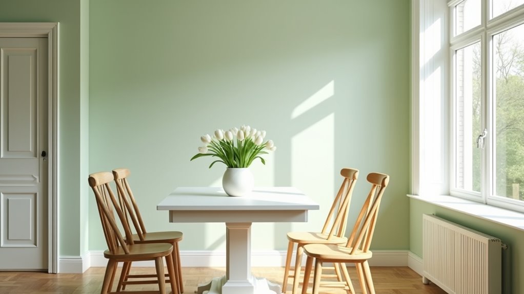
Sage Green: Nature-Inspired Farmhouse Charm
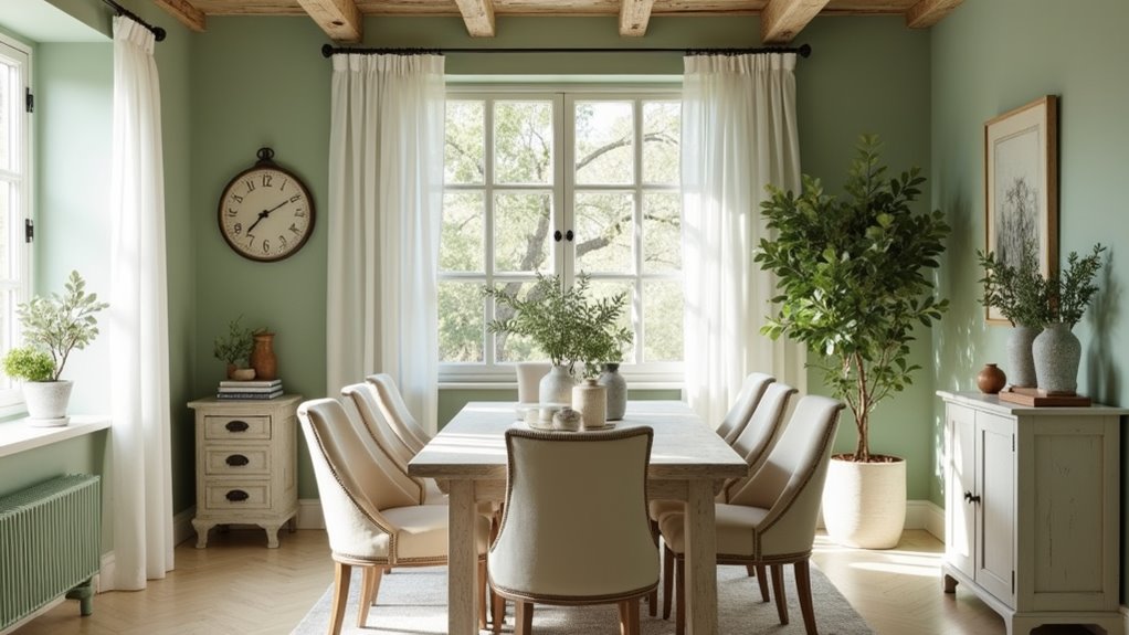
Sage green establishes sophisticated color harmony through its muted green-gray foundation enhanced by subtle yellow and brown undertones that create warmth and earthiness in dining environments.
This nature-inspired hue reflects natural light softly while maintaining visual interest through its complex undertone structure. The color’s versatility enables seamless coordination with off-whites like Sherwin Williams Aesthetic White and complementary neutral palettes featuring muted taupes and beiges.
Sage green contrast emerges effectively when paired with pastel accents or deeper blue-gray tones, creating dimensional depth without overwhelming brightness.
Sage green textures benefit from matte or eggshell finishes that diffuse light optimally, while natural materials like linen and wood amplify the organic aesthetic.
Popular formulations include Sherwin Williams Sage Green Light SW 2851, offering historic mossy neutrality that maximizes luminosity in farmhouse-style dining spaces.
Dusty Rose: Warm Pink Femininity With Light Appeal
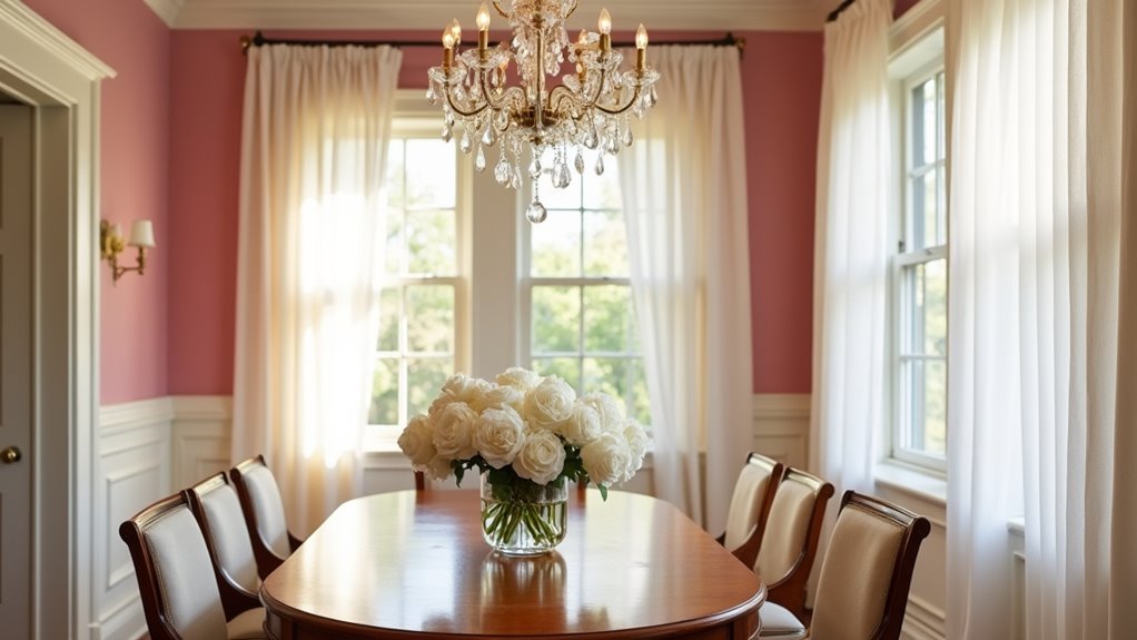
Dusty rose achieves sophisticated color balance through its muted pink base infused with gray and beige undertones that generate warmth without compromising luminosity in dining environments.
This floral mauve creates vintage charm through its inherently nostalgic properties, establishing an emotional connection that transforms utilitarian spaces into intimate gathering areas. The color’s light-reflective characteristics maintain spatial perception while delivering cozy ambiance essential for prolonged dining experiences.
Strategic applications maximize dusty rose‘s versatility:
- Accent wall implementation – Creates focal points without overwhelming spatial dynamics
- Cabinet finishing – Transforms architectural elements into distinctive design features
- Textile integration – Incorporates color through placemats, curtains, and upholstery
- Lighting coordination – Enhances warm-toned fixtures for cohesive atmospheric development
Pairing dusty rose with creamy whites, rich wood tones, or deep charcoal creates balanced palettes suitable for contemporary and traditional design schemes.
Greige: The Perfect Balance of Beige and Gray

Greige represents an evolved neutral that synthesizes beige’s inherent warmth with gray’s sophisticated coolness, creating a hybrid tone that adapts seamlessly to varying lighting conditions while maintaining optimal light reflection in dining environments.
This chromatic balance typically favors gray dominance while preserving beige’s warming undertones, resulting in exceptional greige versatility across traditional and contemporary design schemes.
The color’s adaptability enables effective pairing with diverse palettes, from muted neutrals like cream and taupe to bold contrasts including emerald green and navy blue.
Strategic greige color combinations incorporate metallic accents such as brass or silver to enhance sophistication, while natural wood tones create inviting warmth.
This neutral foundation accommodates varied textile selections and lighting configurations, establishing cohesive flow in open-plan dining spaces while providing practical maintenance advantages over pure white alternatives.
Greige’s balanced tones particularly complement transitional design aesthetics through their ability to harmonize with both traditional and contemporary elements in dining room environments.
Lavender Mist: Airy Violet for Modern Spaces
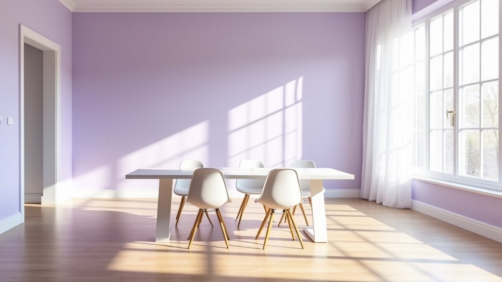
Lavender Mist establishes itself as a sophisticated violet-based neutral that harnesses blue-violet undertones to create an ethereal ambiance particularly suited to contemporary dining environments.
With an LRV ranging 63-64, this Benjamin Moore Color Preview selection delivers moderate light reflection while maintaining color psychology principles that promote tranquility and spatial enhancement.
The shade’s compatibility with modern aesthetics stems from its balanced thermal properties and versatile application potential:
- Light Enhancement: Moderate LRV amplifies natural illumination without overwhelming brightness
- Tonal Versatility: Functions effectively on walls, ceilings, and trim for cohesive design schemes
- Complementary Pairings: Harmonizes with neutrals like Distant Gray and Chantilly Lace
- Atmospheric Control: Creates airy, expansive perception through strategic color temperature balance
This violet-based neutral transforms dining spaces through calculated color theory application.
Buttercream: Gentle Yellow Warmth and Comfort
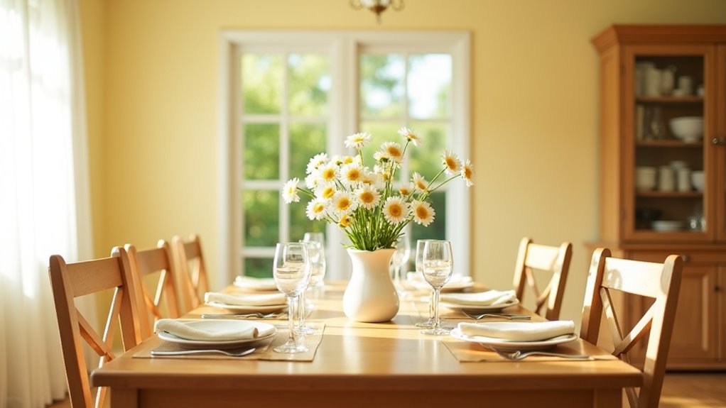
Buttercream establishes itself as a sophisticated warm neutral that leverages gentle yellow undertones to create inviting thermal comfort within dining environments. This pale yellow-to-off-white hue functions as an effective light reflector while maintaining chromatic warmth that distinguishes it from cooler neutrals.
The color’s inherent versatility allows seamless coordination with natural wood elements and earth-toned palettes, establishing classy decor foundations. Psychologically, buttercream generates emotional warmth through its food-associated nomenclature and inherent coziness factor.
The hue softens architectural angles while enhancing spatial perception in compact dining areas. Its soft ambiance complements both artificial and natural lighting systems, creating dynamic illumination effects throughout daily cycles.
Practical applications include accent wall treatments and monochromatic schemes utilizing deeper cream variations. The cozy atmosphere achieved through buttercream’s thermal qualities makes it particularly effective for intimate dining experiences requiring both sophistication and approachability.
Chalk White: Minimalist Brightness With Maximum Light Reflection
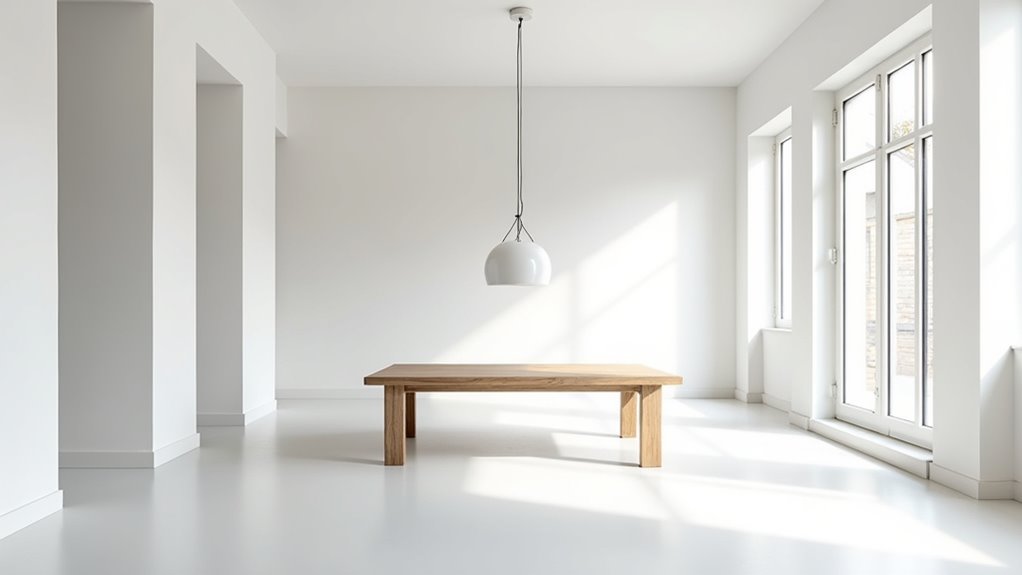
While warm neutrals like buttercream provide cozy thermal comfort through yellow undertones, chalk white represents the opposite end of the chromatic spectrum, achieving maximum luminosity through near-pure reflectance properties.
Benjamin Moore 2126-70 Chalk White achieves an exceptional Light Reflectance Value between 83.13-84.49%, positioning it among top-tier architectural whites for light optimization in residential applications.
This minimalist elegance solution offers distinct technical advantages:
- Maximum light distribution – reduces shadows and amplifies available illumination
- Spatial enhancement – visually enlarges confined or window-limited dining areas
- Energy efficiency – high reflectivity minimizes artificial lighting requirements
- Design versatility – creates neutral backdrop for furniture and decorative elements
Chalk White’s near-ceiling LRV performance makes it particularly effective for smaller dining spaces requiring enhanced brightness without sacrificing contemporary aesthetic appeal.
Aquamarine: Crisp Blue-Green Vibrancy
Beyond the stark luminosity of architectural whites lies aquamarine’s sophisticated blue-green composition, which delivers exceptional spatial enhancement through its unique chromatic properties.
The hex code #7FFFD4 demonstrates aquamarine’s balanced RGB composition of 49.8% red, 100% green, and 83.1% blue, creating optimal light reflection for dining environments. This chromatic balance establishes effective color harmony when paired with complementary blues and whites, generating refreshing palettes that expand perceived room dimensions.
Aquamarine’s inherent tranquility makes it particularly suitable for calming spaces where social interaction occurs. The color’s lightness value creates airy, open atmospheres while maintaining visual interest through its cyan-green duality.
When applied to dining room walls, aquamarine provides spatial brightening effects while offering sufficient chromatic depth to prevent sterility, making it superior to neutral alternatives for contemporary interior applications.


